HCA REBRAND | LONG LOVE ASPEN | DALI ALIVE | QUICKSILVER
Case Studies – HCA Rebrand
The Project:
HCA / Health One Rebrand
The Client:
The Pinecone Project for
HCA Healthcare
The Situation:
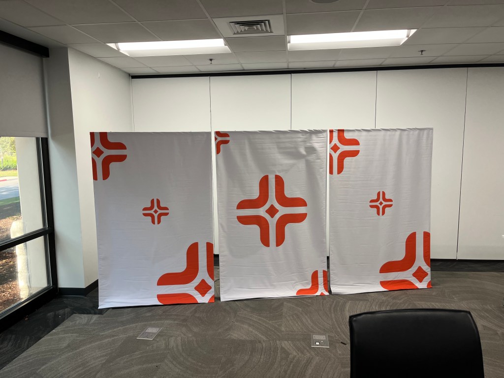
HCA Health One, one of the largest hospital networks in the country, needed to consolidate its brands under one cohesive look. Rolling out a new name and logo throughout the entire Denver metro region at the same time is no small feat. The Pinecone Project, the agency working directly with HCA Health One needed fabrication partner vendors to assist with various built elements to support this rollout.
The Solution:
There were seven different hospitals that would each have concurrent logo reveals. We needed to figure out how to do this in a dramatic way that was foolproof and effective. The solution ended up being 7 sets of graphics, some as large as 16’ wide by 12’ tall that could be remotely controlled to drop a cover and reveal the new logo, identity and key values. We worked to coordinate the large format printing of all these pieces, almost 50 in total, and made matching covers held in place with electromagnets. At the push of a button, power to the magnets was cut, the covers dropped, and the new identity was revealed without a hitch. We had successfully printed and created stands for each of these pieces, designed a working technical solution for the reveal, installed them throughout the Denver Metro area and made sure our client, The Pinecone Project had this fully taken care of for this critical moment.
The Result:
A seamless and successful brand reveal at all 6 locations. The rollout supported over 12,000 local emloyees.